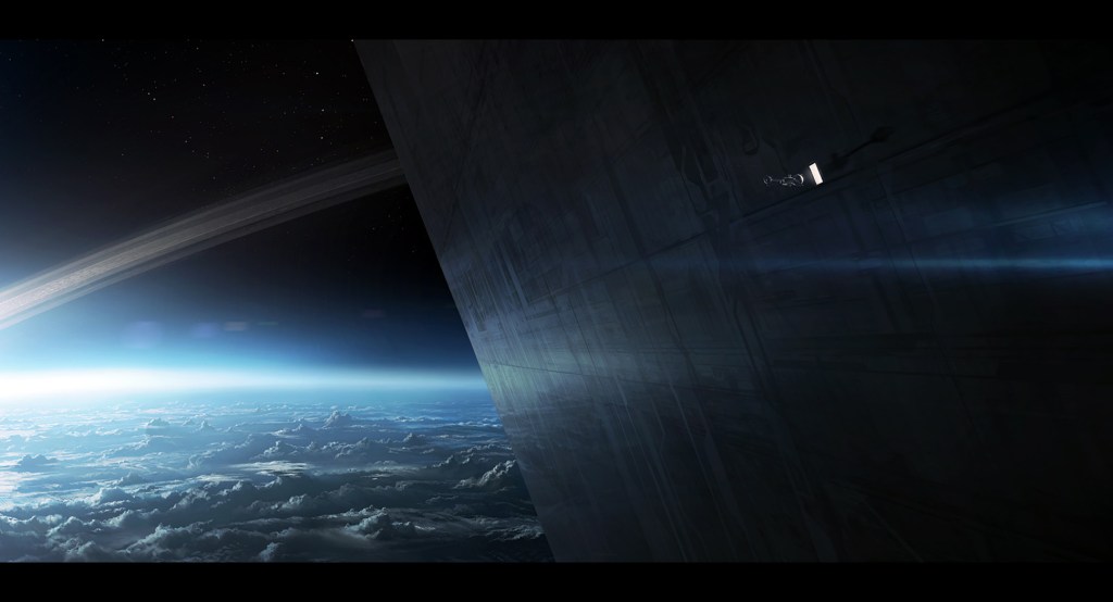
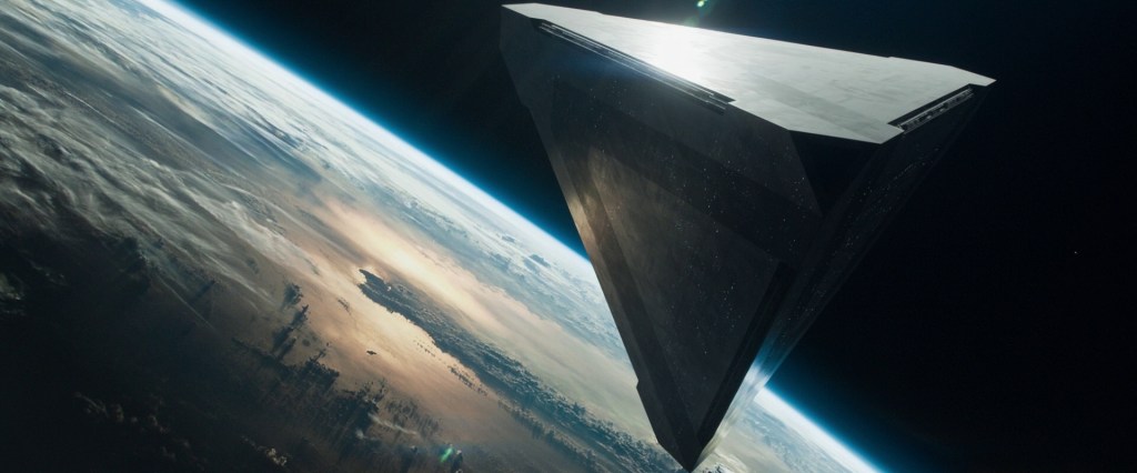
I watched a film recently that I enjoyed thoroughly when I first saw it around 2013 on release. I’m not one to re-watch films, but the visual style of Oblivion has always stuck with me. At the time the VFX were ground-breaking, laying the foundations for techniques that are currently at the cutting edge. The story is great, albeit not entirely original in the science fiction realm, however it was wrapped in this simply stunning visual storytelling. Those VFX look great today, over a decade later.
This is the point where I ask you to watch the film if you haven’t already, you won’t regret it and I won’t feel bad for spoiling things for you.
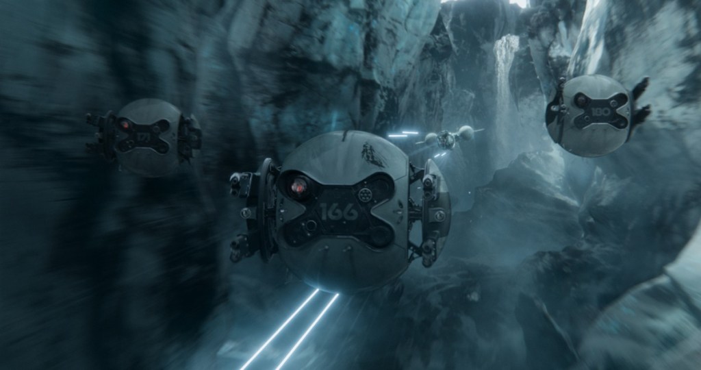
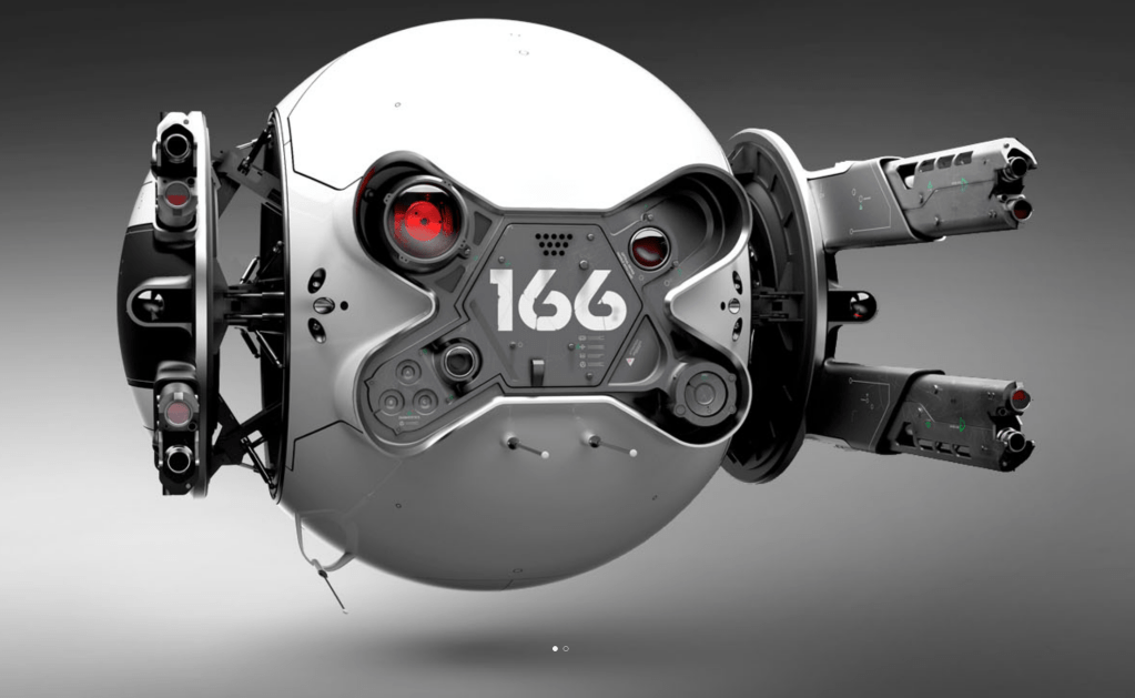
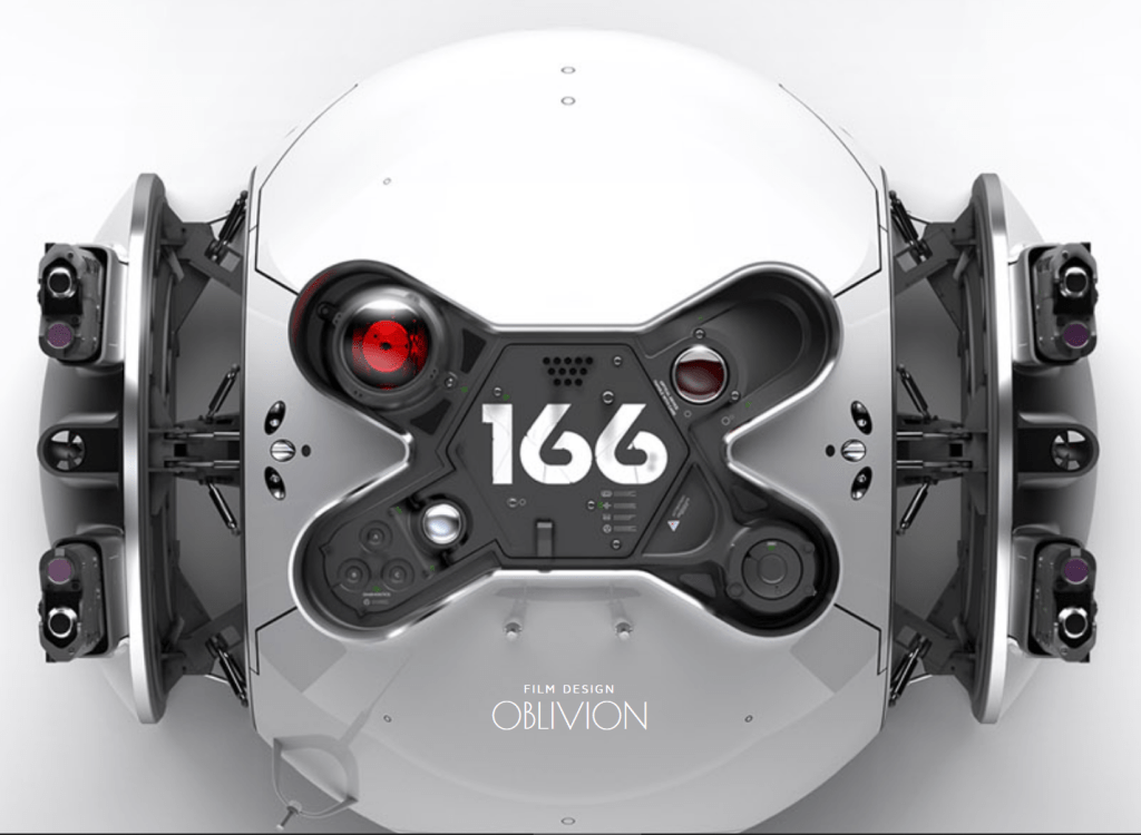
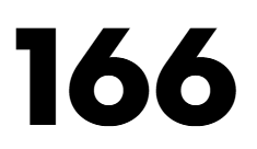
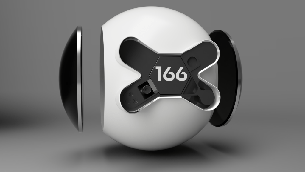
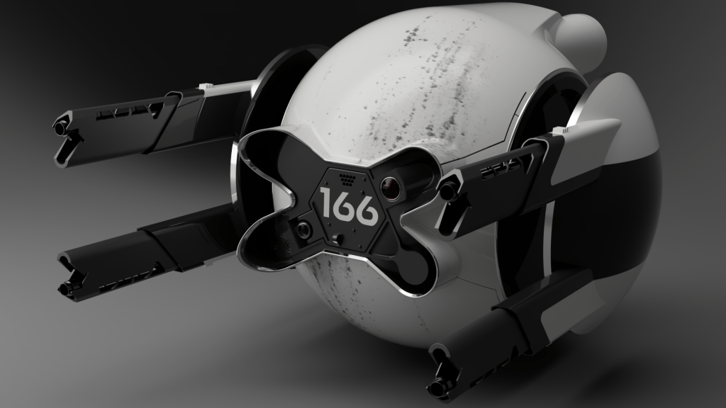
Drone 166
Aside from Tom Cruise there is another character which stands out in the form of an automated drone. Most often this is Drone 166 although they are not the only one of their kind. This drone, despite not having many moving parts, manages that wonderful feat of making us anthropomorphise it; much of this is due to the design but helped by the movement and the atmosphere around it.
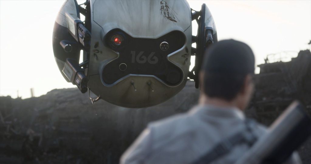
And there is something deceptively simple about that design, it feels approachable, it makes sense in the minimalist design philosophies we’re used to with current products. In some way these drones feel like you could see them around right now functioning alongside phones, tablets, and electric cars. Given they were designed over ten years ago, it’s quite impressive to still feel modern with how fast technology develops.
The itch…
When the film ended, I got this itch… I wanted to explore the design. It wasn’t for any real reason I could articulate, I didn’t aim to print it, or sell it, or publish it, or even learn from it. I had the overwhelming urge to follow the footsteps of the designer and it took me a while to figure out why. And to avoid teasing you, I found after some research the drone was designed in Solidworks, a parametric 3D modelling program you’d use for real world product design. That’s why it felt approachable and familiar to me, I have experience in similar programs. The tools used to make something leave an impression on the resulting product. I think it’s best to compare the feeling I had to finishing reading a novel and wanting to write fan fiction, reimagine and explore the characters further so you gain a deeper understanding of them and how they were crafted.
Let the doodle commence
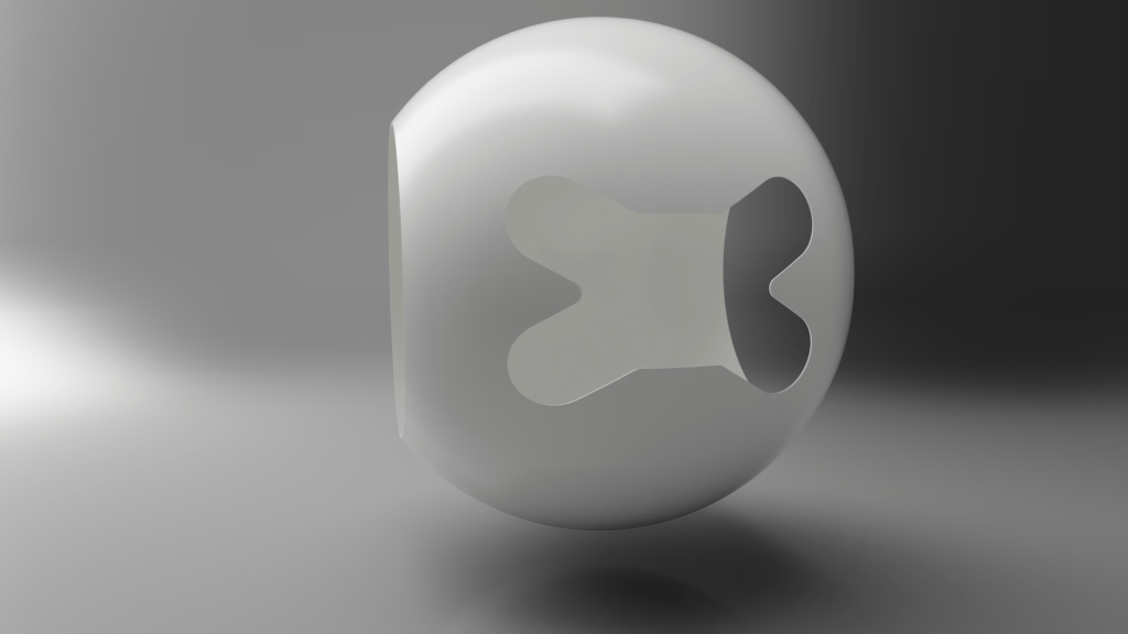
I began to doodle in Fusion360. I created a sphere with flat sides, then shelled out the core leaving the sides open. I then punched the front shape out. It took a lot of staring at every reference photo I could find to figure out the front shape exactly.
Para metri – what now?
Parametric modelling programs are like drawing on paper with a ruler, angle measure and a compass; every line is set to an angle, length, curve or whatever numbers describe it. Compare this to Direct Modelling programs often used to create artistic models; which use points in space connected by lines to make flat faces that together make up the surfaces of an object. Both program types can create a similar model, but in different ways which lead to different strengths and weaknesses, leaving small tells which was used.
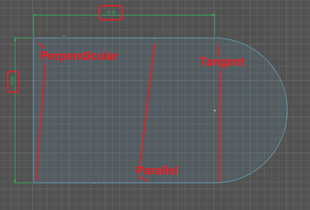
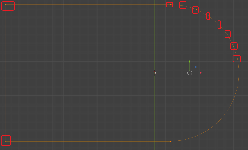
You can see the difference above, Parametric programs will define the shape mathematically, Direct programs will connect the dots. It’s all numbers, just handled in different ways. Parametric being limited to defining everything mathematically often gives it a more artificial, ordered look.
Satisfying shapes
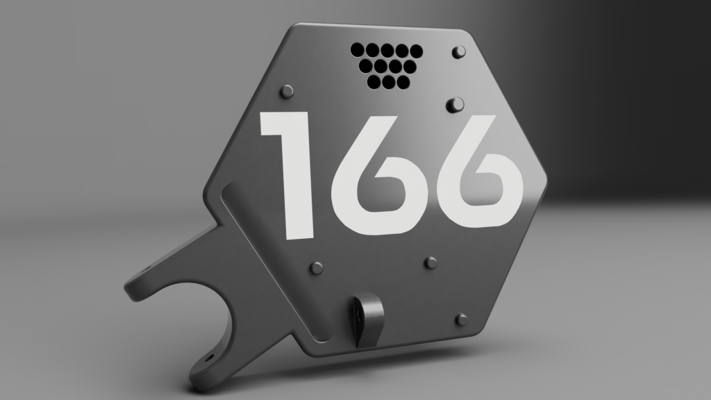
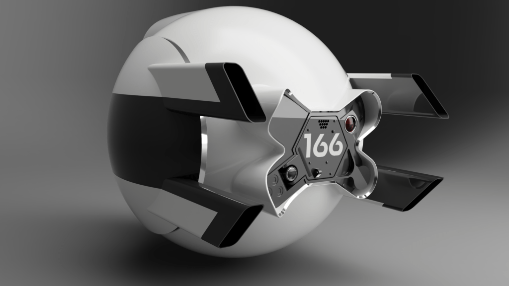
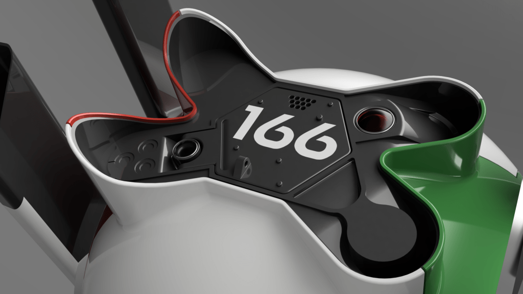
I added some sides to the bone shaped cut out in the front of the body, gave them a chamfer and made them shiny silver. I then created a new part which would be the gray-black insert to go into the front that would contain all the detailed parts around the front hatch. Putting it all together in an assembly and throwing a bit of detail at the insert I got a satisfying model that already looked pretty recognisable.
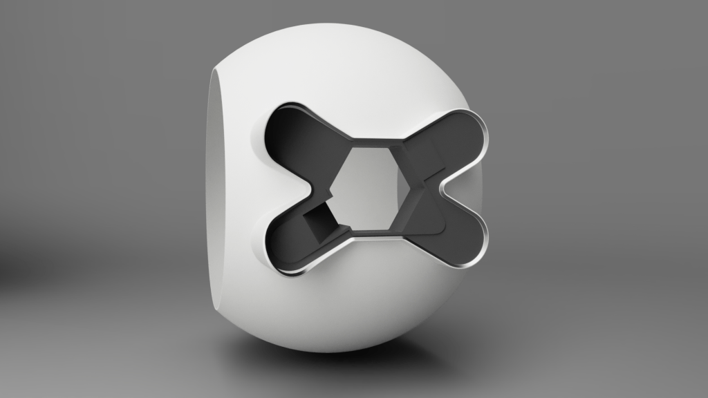
I hadn’t held myself to any order of business, I just wanted to model whatever felt fun, so I set to work splashing more detail on the insert. I added some detail on the left, the part where the hatch hinge is located which has some kind of lens thing, and carved back the right hand side a little to make a start over there.
It’s not really the normal way of modelling for me cutting away at a block like this, it’s not totally unusual, but more often I’m used to having a specific part to create with dimensions and requirements of fit. I’d have a hinge to place that has to function, or a camera to house, those components would drive the design of the housing, here I’m designing a housing with no components.
When a font is not a font
At this point I added the hatch and sides. This seems really simple, and for the most part it was, until I got to the font…

What font is that? hmm.
It’s not a font, you won’t find it anywhere. And so a long arduous journey of research began. I’ll save you a lot of long winded research, but if you do want to dig deeper this link is a great write up of the typography design in Oblivion by the type designer for the film Jens Gehlhaar.
So what is it? Jens’ last paragraph gave me the information I needed and that’s good news, what isn’t good news is the work it’d then take to replicate it.
So I’d need to get hold of Neutraface and then edit it as close as I could to match the marketing team’s work. Step one was hampered by the fact Neutraface is a professional and expensive font; however, since I’m doing this only for me, with no intention to sell it, or make any money whatsoever from it, I borrowed the font.
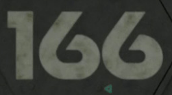
This is what Neutraface looks like for “166” straight out the box, I’ll side by side it with what I needed.
Off the deep end we go into font editing
I’d never edited a font before, or created one. Honestly I’ve always been curious and this was a stellar excuse to wander off down that path of discovery. After some brief GoogleFu I landed on FontForge, a free tool to fiddle fonts. Now this was definitely way off the deep end because the tool could do a lot more than I needed and was not entirely made for the blind stumbling noob that I am. I’ll admit that after making changes I genuinely could not make the font have a different name when searching for it in Fusion, despite changing the name in 4 different places…
This is what the font sheet looked like for the 6 once I was done butchering it, and alongside it the butchered 6 itself.
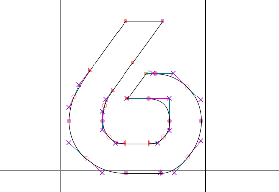
You can see the font is just made from a bunch of connected splines, it was pretty simple-ish to play around with them, I mostly struggled with keeping them aligned until I found some hotkeys and things. Is it perfect, nope, but I think it’s passable at a distance.
And then it all looked funky written as 166 as the spacing was all wrong, so I fiddled that until it looked right.
And then the 1 wasn’t the right size either, so I edited that too…
Finally!
Where was I? Ah yes.
“At this point I added the hatch and sides.” I think I nailed the font nicely.
Behind is the behind
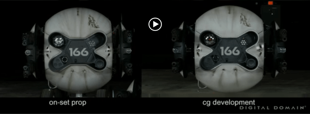
I loved how the front was coming along, but after the font fiasco I needed a small break from it. And around this time I realised the rear of the drone wasn’t simply a sphere. I’m honestly not sure how I hadn’t noticed up to this point, I think the engine draws your eye enough to miss it.
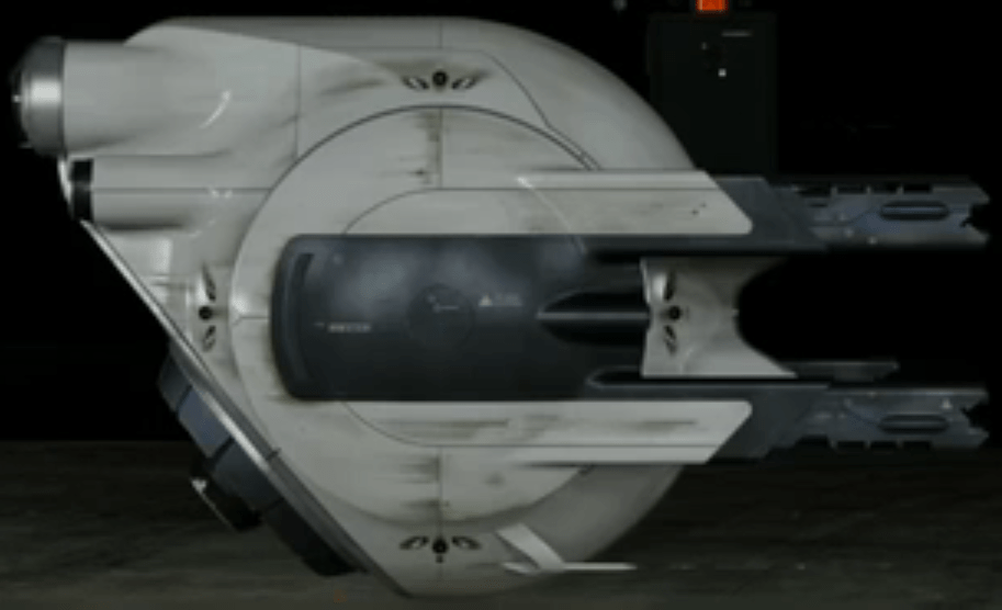
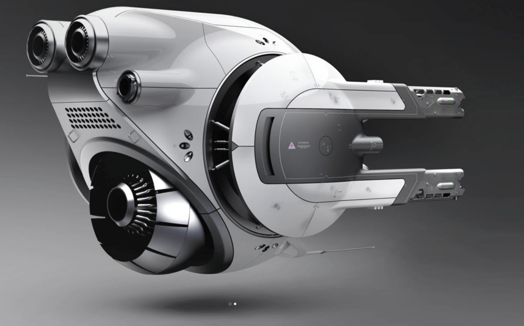
You can see the shape in the reference pictures I found, one from Digital Domain’s CGI replication of the on set prop, and one from the original artist Daniel Simon. It’s worth noting that I used Daniel Simon’s concept art images extensively for this modelling so far, as they are by far the most detailed ones around; this plays an important role later…
Getting this shape to work was honestly very challenging, I was trying to figure out what combination of procedures were used to create it. There are a number of approaches you could use, subtractive or additive being the initial choice to make. Do you slap a big block on the back and then carve it down, or do you add bits onto it one by one until the shape is right. I don’t think I managed to figure out the exact process that was originally used as mine has slight differences to the reference pictures.
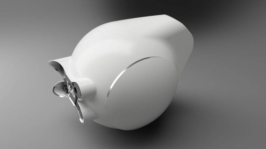
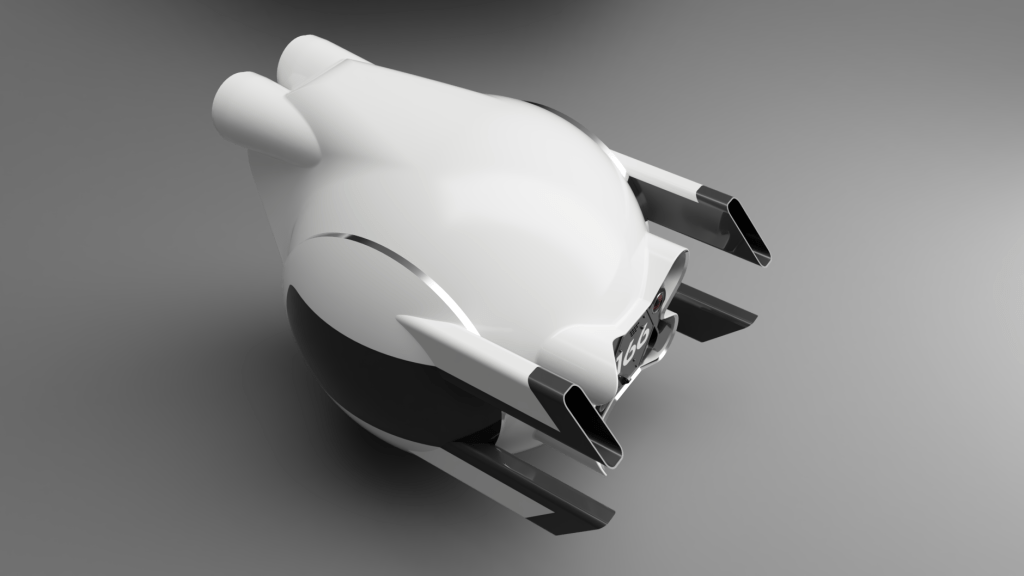
This was my first pass at the rear. You can see I also realised the side pods were white.
Back to the front
The rear wasn’t as much fun to work on as the front, so I switched round to work on the hatch. It was nice to focus on a single part and get it to a finished state. I think I had the most fun working on the hatch out of everything at this point. I shifted the text a bit, added holes, bumps, chamfers, a slice into it and a small clip hoop thing.
When should I stop?
That’s the question I was asking myself. I’d tried to see the project as having some purpose as by now I’d sunk a fair amount of time into it. I’d considered it for 3d printing as a model for display, but given the detail level I was using it wouldn’t really work unless it was huge. I’d scaled the entire CAD model to the sizes noted on Daniel Simon’s website, so it was about 2m in size.
I settled on the idea it was a learning exercise for me in Fusion360, fonts, and design in general. But really, did I need a reason or purpose to come out of this to justify it? I felt like I did, or still do, that’s one of the main reasons for blogging it here and the existence of this blog page at all. I felt like I was putting all this work in only for it to go nowhere, and I couldn’t wrap my head around that. Also I felt like I had to finish the entire thing for it to have any value, but by blogging it here, even a partially finished project still holds some value and closure at that moment.
It’s time to get pretty
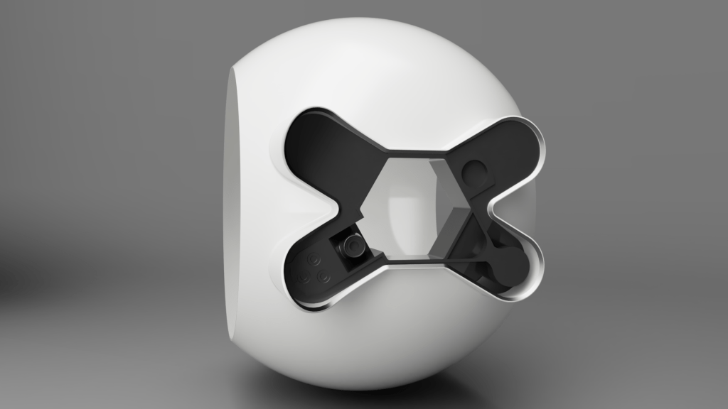
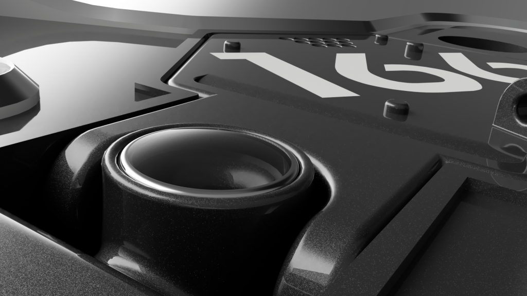
I wanted to play with rendering and prettier materials. I spent some time working on the hinge point for the hatch including putting a fake lens in there. I swapped out the material for paint with flake in it and set up a tidy render angle.
I really love how it’s looking.
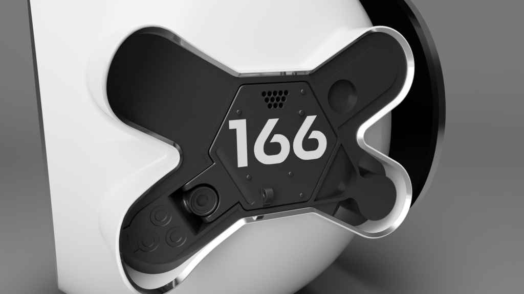
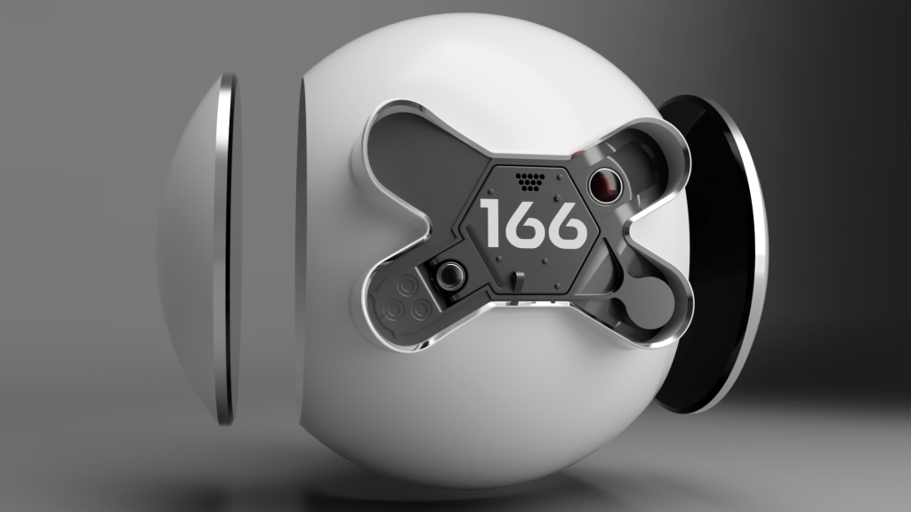
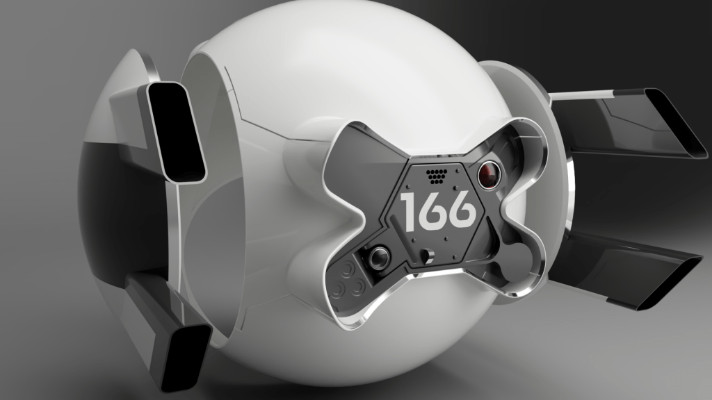
I was hooked on the pretty renders so worked on the red lens in the top right section and rendered that out. Both of the lenses are two parts, glass and an aluminium bezel.

That got the drone looking like this so far.
That’s not quite right…
As I was checking reference images for a better angle on things, I realised a bit of an issue. I’d jumped head first into designing this, using the amazing renders on Daniel Simon’s site as my main source, only referencing other images if I got stuck for an angle. When checking certain parts for alignment I realised the final film version deviated in certain details from the concept work. Oops.
You can see the red lens on the right isn’t there, the lens on the hinge isn’t there either. I think the concept model is somewhat more spherical in places round the back than the movie one too, maybe it’s just the way pictures are taken, it’s hard to know.


Pew pew
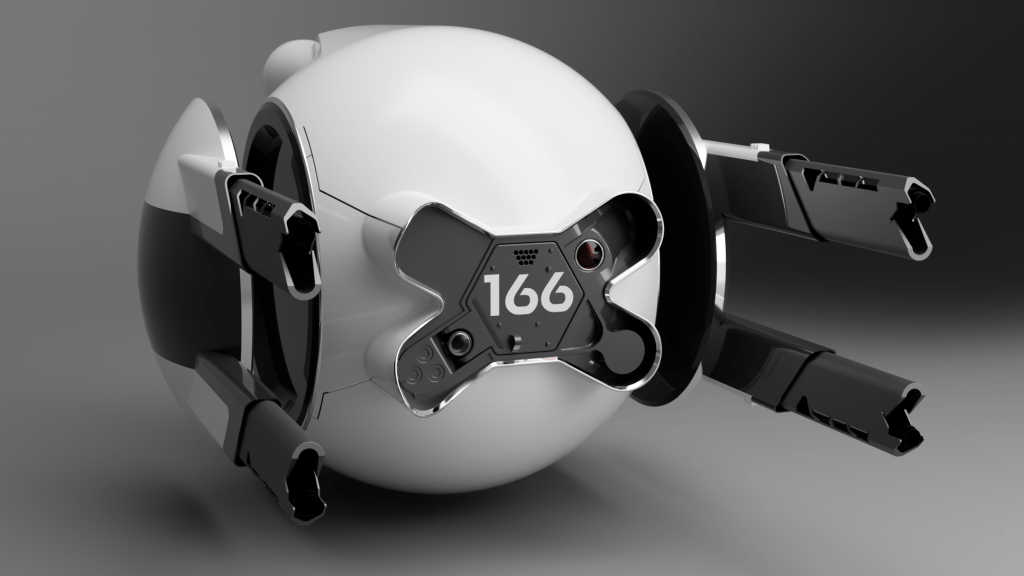
Next up I wanted to get working on the guns, they give the drone so much character and really frame it preventing it looking like a simple cue ball. Looking at the reference images I decided the pods were two parts; the white part was the pod structure and the black section an insert.

I cut into the white part and then created a matched dark part that would seamlessly slot in. I added the gun housing tubes into the dark part and then recessed them to accept an outer casing made from the white part. As real manufactured parts the dark section would slot neatly into the white one from the front.
Engines go zoom
I felt myself running out of steam on the project at this point, chiefly because it’d taken days of work getting to where I was for what was originally intended as an aimless doodle. So I got to work on more key parts to give the drone some shape, I added the engines at the rear.
I did not expect this to turn into a nightmare.
The issue came where the engines meet the previously mentioned difficult shaping of the rear, it turned out I hadn’t quite got the rear right, and the engines therefore wouldn’t align correctly. They are a certain size cylinder and go straight forward into the body, where they meet the body contour they create a distinct curve. If the body isn’t the right shape the curve is way off and it looks totally wrong compared to the reference images.
My choice was to go back and rework the body, which took a long time the first go around and I wasn’t keen, or to fudge the engines to look ok. I hate fudging things, I’m quite the perfectionist, but the choice was fudge them or abandon the project right there. I just wasn’t up for fighting with the body shape again. This is the compromise I ended up with.
Chop chop
The next part I felt was important to get the drone feeling right, and was more interesting to me, was putting the panel cut lines in. I’d built the body in one complete part knowing that it was in fact made from multiple panels. My intention was to chop the body up later to achieve this.
It turned out to be really difficult to do as cutting a slot perpendicular to a complex 3D curved surface is tricky. The internet said use the emboss tool, after hours of failure, I found one amazing soul who suggested using a sweep instead, it worked great. I love the panel gaps.
Cutting the panel gaps also let Fusion know these were now different parts, I coloured them while working to make it easier and couldn’t resist a nice render.
Ooh shiny
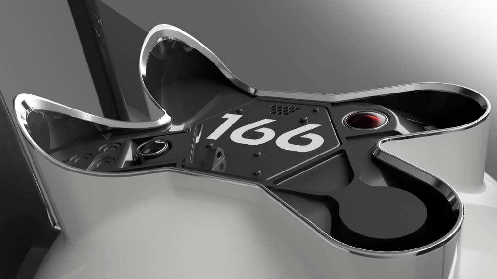
The front had lost its shiny edge, and I’d never really intended to properly resolve that, instead opting to just “paint” the face material at the front shiny. The issue is that my new panel cuts had left a visible seam on the front face which definitely shouldn’t be there. So, I opted to create a separate bezel part to fit onto the existing front. This kind of thing really should have been designed in at the start, as I had to do a lot of ugly chopping of the front face to recess it back a bit.
I took measurements of all the resulting shapes and created a bezel using them. In a paid version of Fusion360, or any other paid CAD I could have just made a part within the assembly and used the other parts as references for it, but free Fusion doesn’t include that. So I did it the long way.

Very happy with how the bezel turned out and it looks great in place.
Pew pew pew
More work on the guns; well, actually working on the guns not just the housing this time. Again this is somewhere I think there are minor differences between the concept and the movie drone, differences so minor I won’t bore you with them. Ok, it’s the cooling vent slot cut outs, they may or may not have a slightly different angle, no idea, I matched mine as best I could to the concept one. I also added little bump things onto the white gun housing parts.

Seal her up
With momentum failing fast I wanted to at least get the model sides sealed up so the gun pods could be open without seeing the hollow sides of the main body. I made a dark insert part to go in, and an aluminium bezel to go around the outside of that. I also noticed I’d left a sharp corner where the gun housing white and dark meet, so rounded that off at the same time.
End of the road, for now
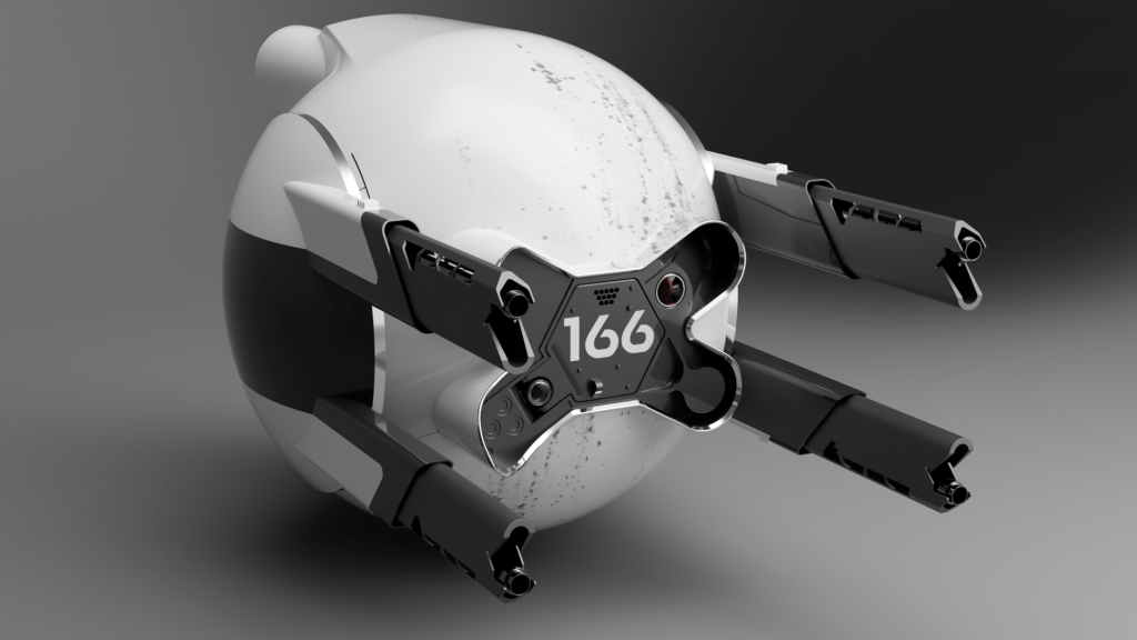
With one last push I retextured the guns and learned how to apply decals to the surface of the white body to take the model out of pristine CGI and into some realism. I think ultimately the best way to texture it is to fully export it into a 3d modelling program and texture it there, but no way was I up for that level of work for an unfinished model.
I will say that I am very proud of what I achieved in a few days. There was a lot of learning involved, lots of research across many different areas, use of new tools, and an appreciation for the art that went into the original model.
Are there other models of this drone out there? A lot, yes, some are better than others, some are for 3D printing, some are like mine and just a hobby project. It seems this drone inspired a lot of modellers to take on recreating its interesting shapes.
There are many like it, but this one is mine.

Thanks for reading, see you in the next project 🙂
Sources and references:
- Behind the scenes
- Concept art
- Movie prop
- Movie reference
- Typography
- Other models
- https://www.stlfinder.com/3dmodels/oblivion-defender-drone-166/
- https://www.cgtrader.com/3d-models/aircraft/aircraft-part/modification-of-the-oblivion-all-drone-166
- https://www.stlfinder.com/model/oblivion-defender-drone-prop-JQkEQRPl/4525485/
- https://cults3d.com/en/3d-model/art/oblivion-defender-drone-prop
- https://www.thingiverse.com/thing:83193
- https://grabcad.com/library/oblivion-drone-1
- https://grabcad.com/library/oblivion-drone-4
